
Creating a better world, one logo at a time.
A brand is the most valuable asset for any successful product or organization. The ideas or feelings conjured in the minds of consumers is ultimately what a brand is. A great deal of time, effort, and money goes into creating, maintaining, and promoting a brand.
A product or company logo is often the first visual projection of its brand, and is integral to consumer perception. Hence, logo designs by their very nature are some the most challenging projects a designer faces, and I take them very seriously.
A small compilation of various logos follows. Most of the logos were starting points for comprehensive product, company, and/or event identity systems.
____________________
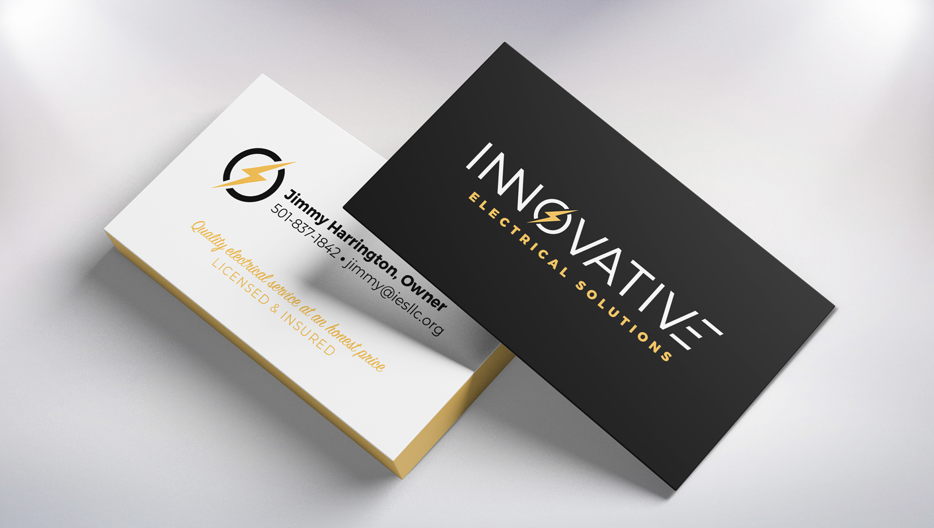
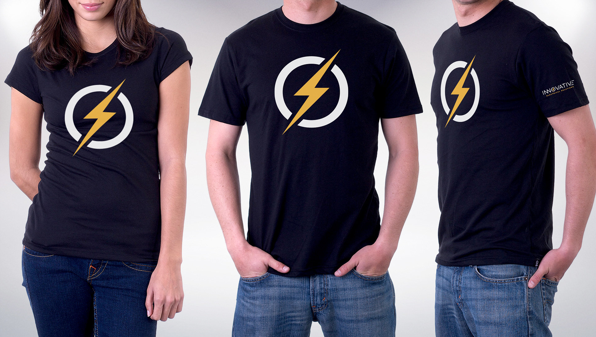
Clean and innovative, this logo with custom drawn letters helps distinguish this company from its competition. Project consisted of business cards, shirts, and vehicle graphics.
Created for for a digital platform which allows patients to have an open dialog with healthcare professionals.
This logo's organic shapes look as though they are merging (think lava lamp), and are symbolic of the synergistic nature of collaboration. The contours have a scientific look, as if magnifying a sample in a petri dish.
Created for an online platform featuring CME activities requiring just minutes of health care professionals' time.
Created for Schering Plough, this logo was for a CME initiative on Acute Coronary Syndrome. The figure with arms outstretched plays off of the word "Balanced" in the program title. The project included workbooks, posters, slide presentations and more.
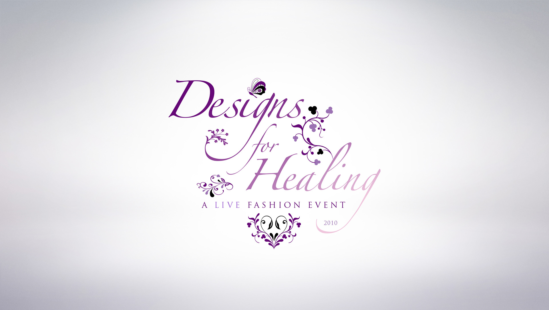
Created for the Healing Consciousness Foundation, this logo design was a donation for a live, black-tie, fashion event Benefiting those diagnosed with breast cancer.
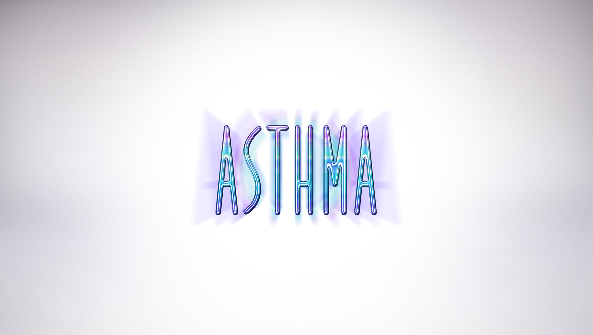
Created for GlaxoSmithKline, this logo consists of hand drawn letters and was for an educational initiative on controlling Asthma.
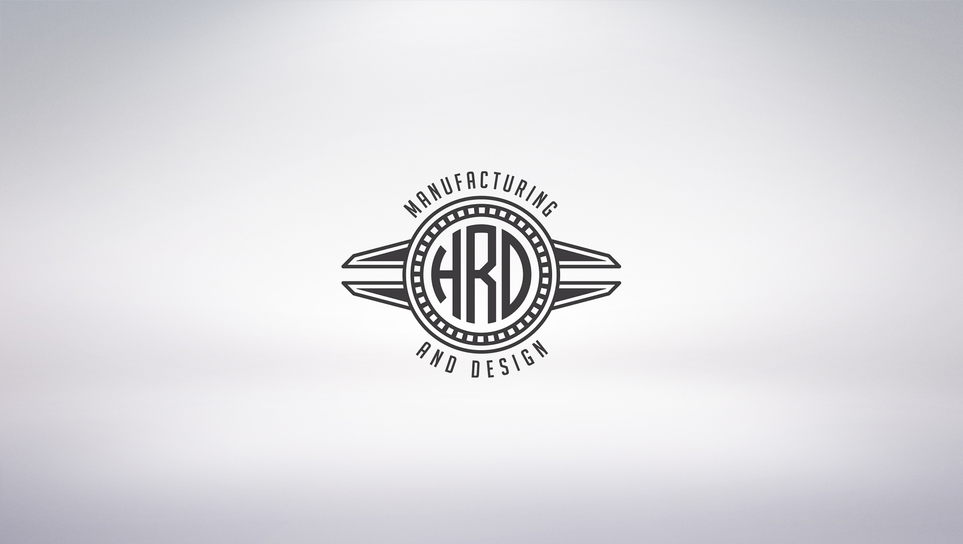
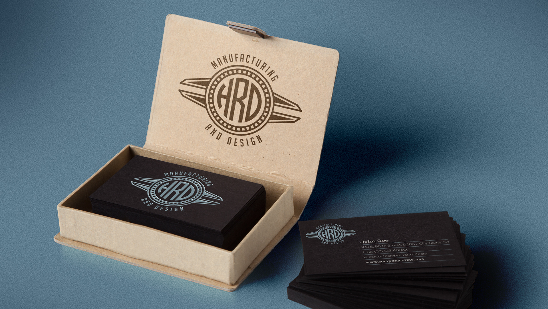
Created for a prototyping company specializing in engraving, laser cutting, and 3d printing, this logo needed to be highly adaptable for a multitude of mediums and processes. It also needed to incorporate measuring calipers and an art deco look and feel.
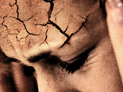
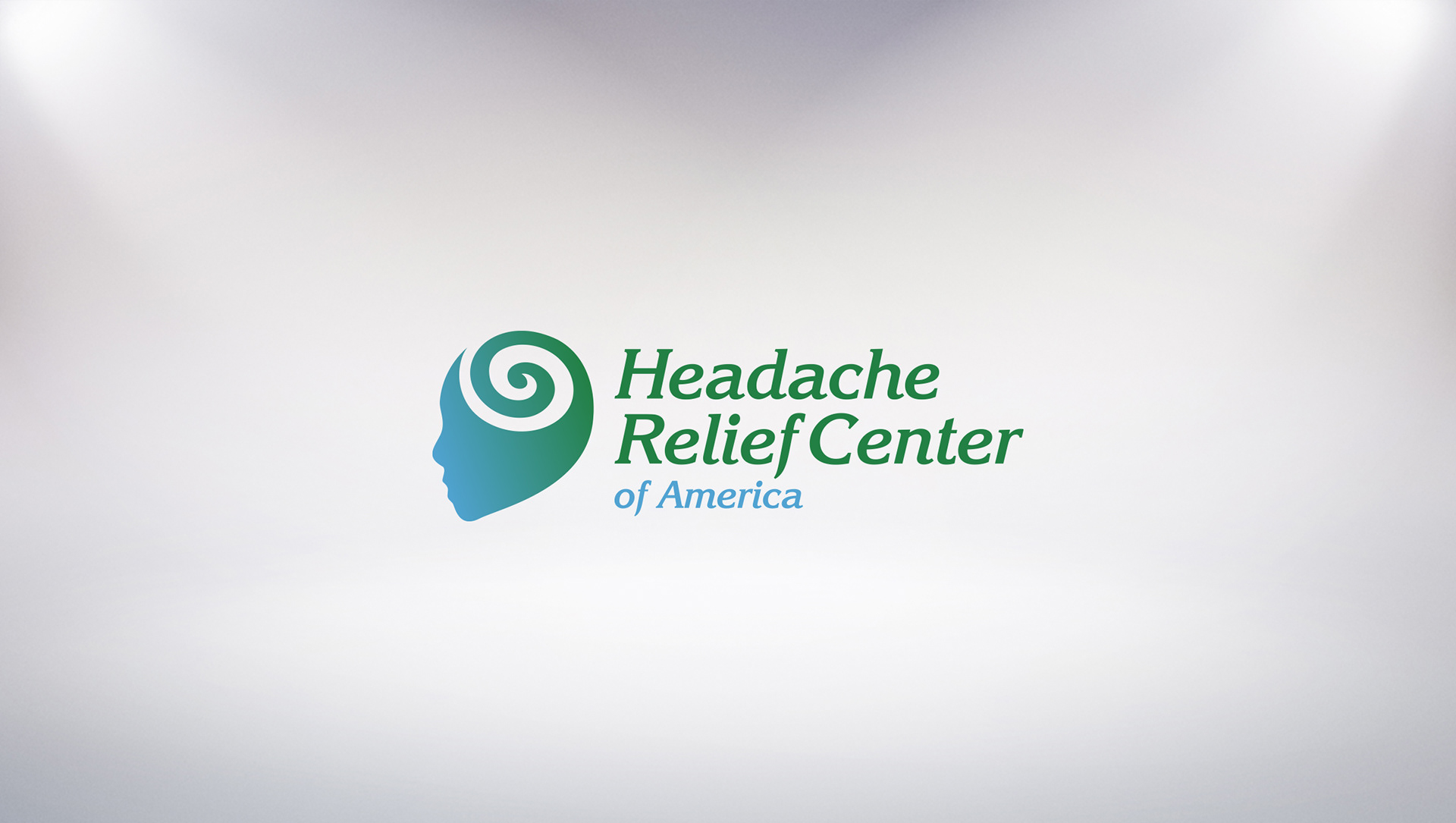
Created for a medical practice dedicated to providing relief to those suffering from migraines. The concept is symbolic of pain leaving the head. The swirl and color scheme provide for a soothing feel.
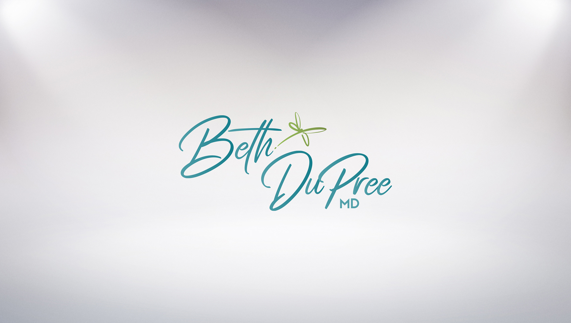
Designed for a prominent physician seeking to move into media, this logo needed to have a highly personal feel. The only requirement was to incorporate a dragonfly, which emerges seamlessly from the end of "Beth".
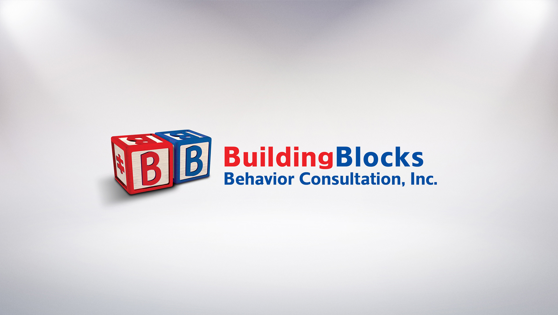
Created for a consultant agency specializing in the behavioral correction of young children. The client desired a subtle reference to autism, so a puzzle piece was worked into the side of the red block.
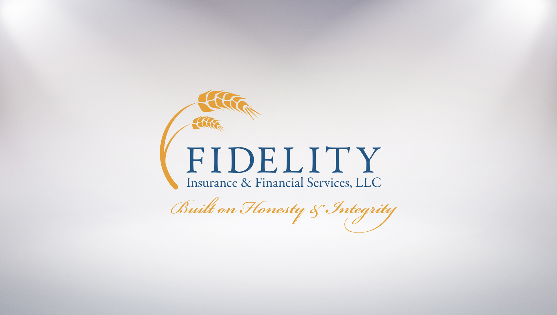
Wheat is symbolic prosperity and wellbeing, and it loosely forms an "F". This logo needed to have a prestigious, trustworthy look and feel, yet still be conservative in nature.
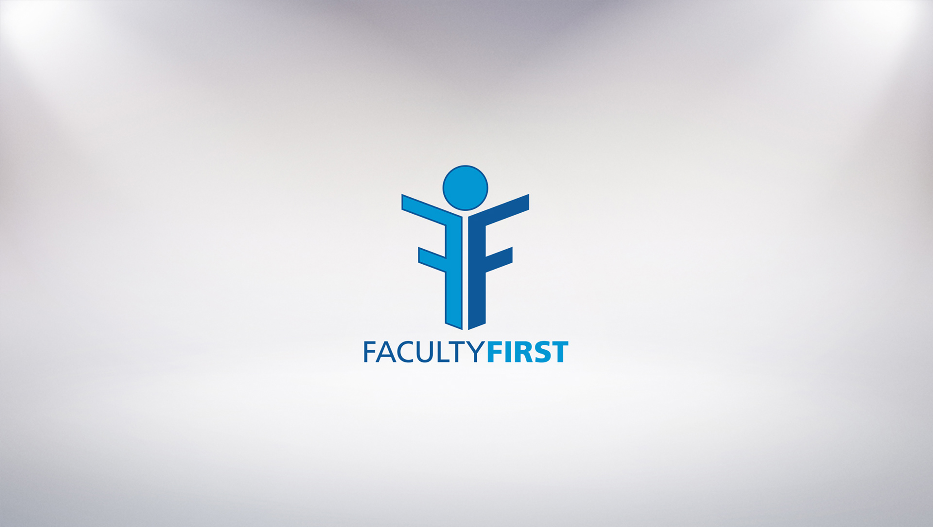
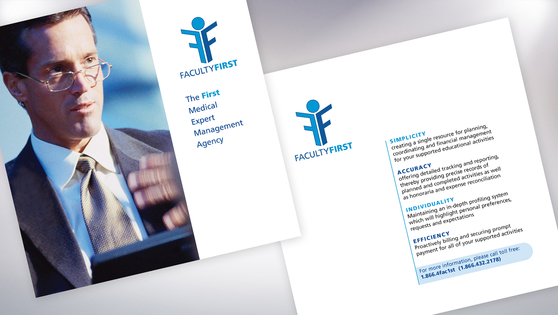
Created for a faculty placement service for medical speaking engagements, the mirrored "F" along with the circle hovering above it form a presenter at a podium with the outstretched arms.
Created for a startup healthcare communications agency, This logo was the catalyst for a complete identity system, which included stationary, a slide presentation template, and a website.
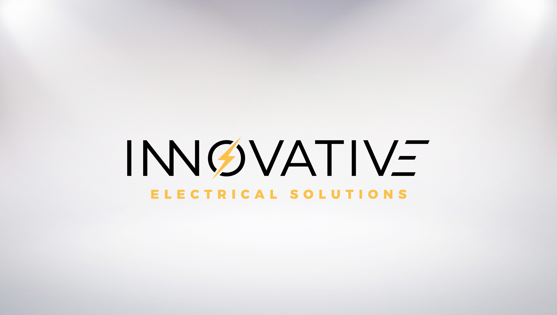
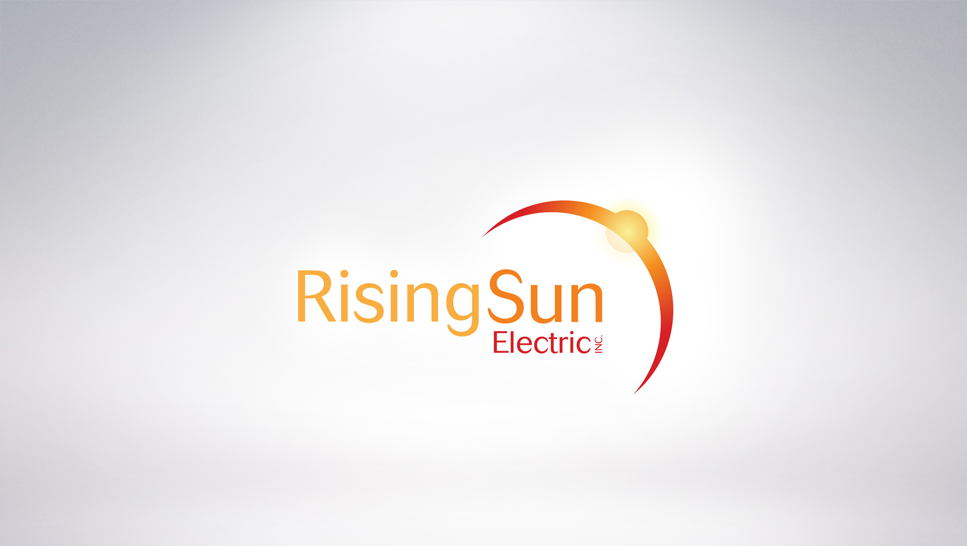
Created for an electrical company with a focus on solar energy, This project included stationary, signage, vehicle graphics, and a billboard.

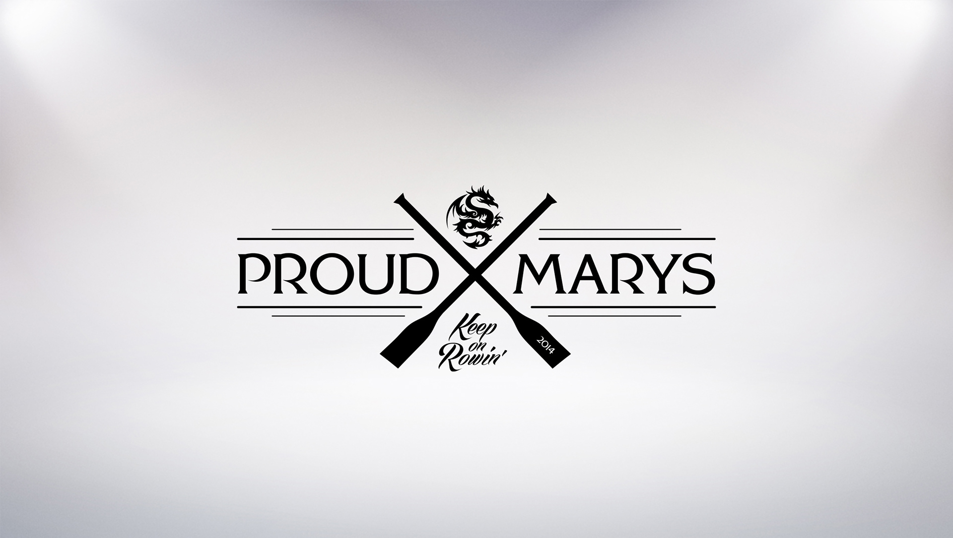
This was A Donation to "Proud Mary's" dragon-boat race team of St. Mary's Medical Center. The race raised over $14,000 for "A Woman's Place", a community-based social change organization committed to the empowerment of women and to ending domestic violence.
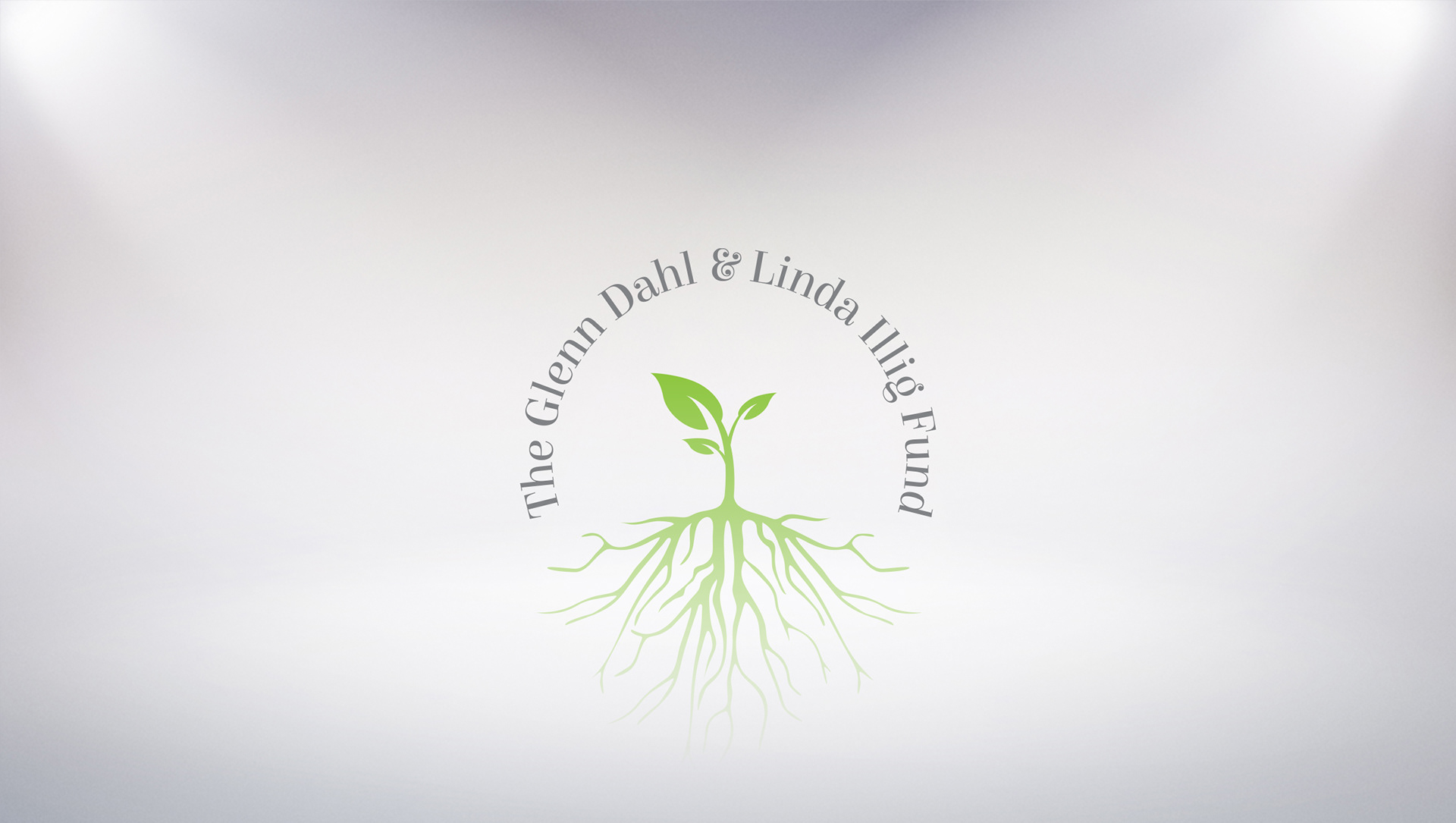
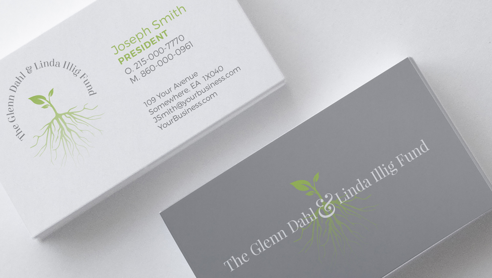
The sprouting seedling represents growth, and how each donation or act of kindness (the network of roots) helps to provide a life of opportunity and growth. The intertwining of the roots and letters symbolizes the intimate, hands-on nature the founders have with this special charity.
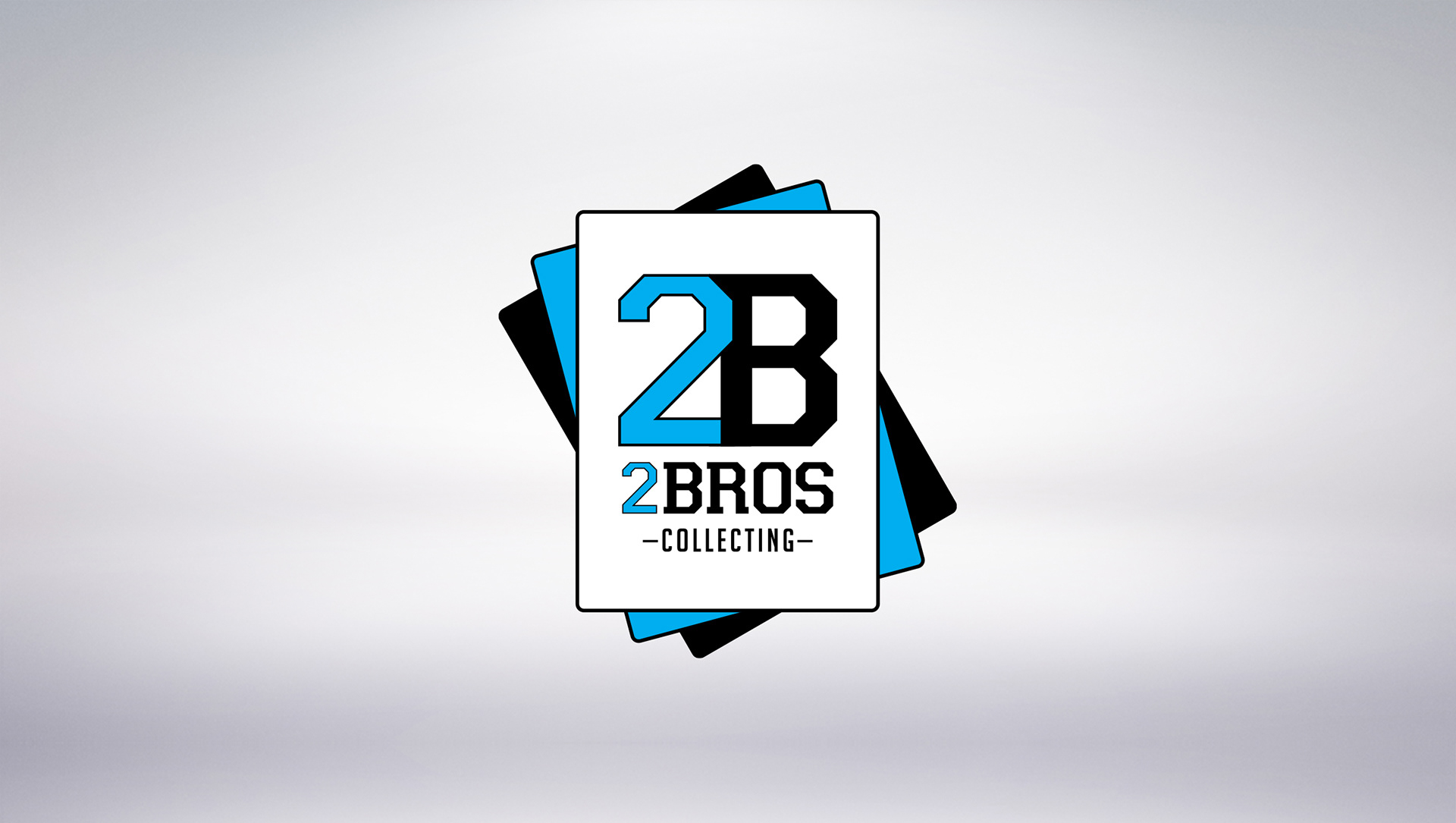
Designed for an online business specializing in the collection, curation, and reselling of sports trading cards.
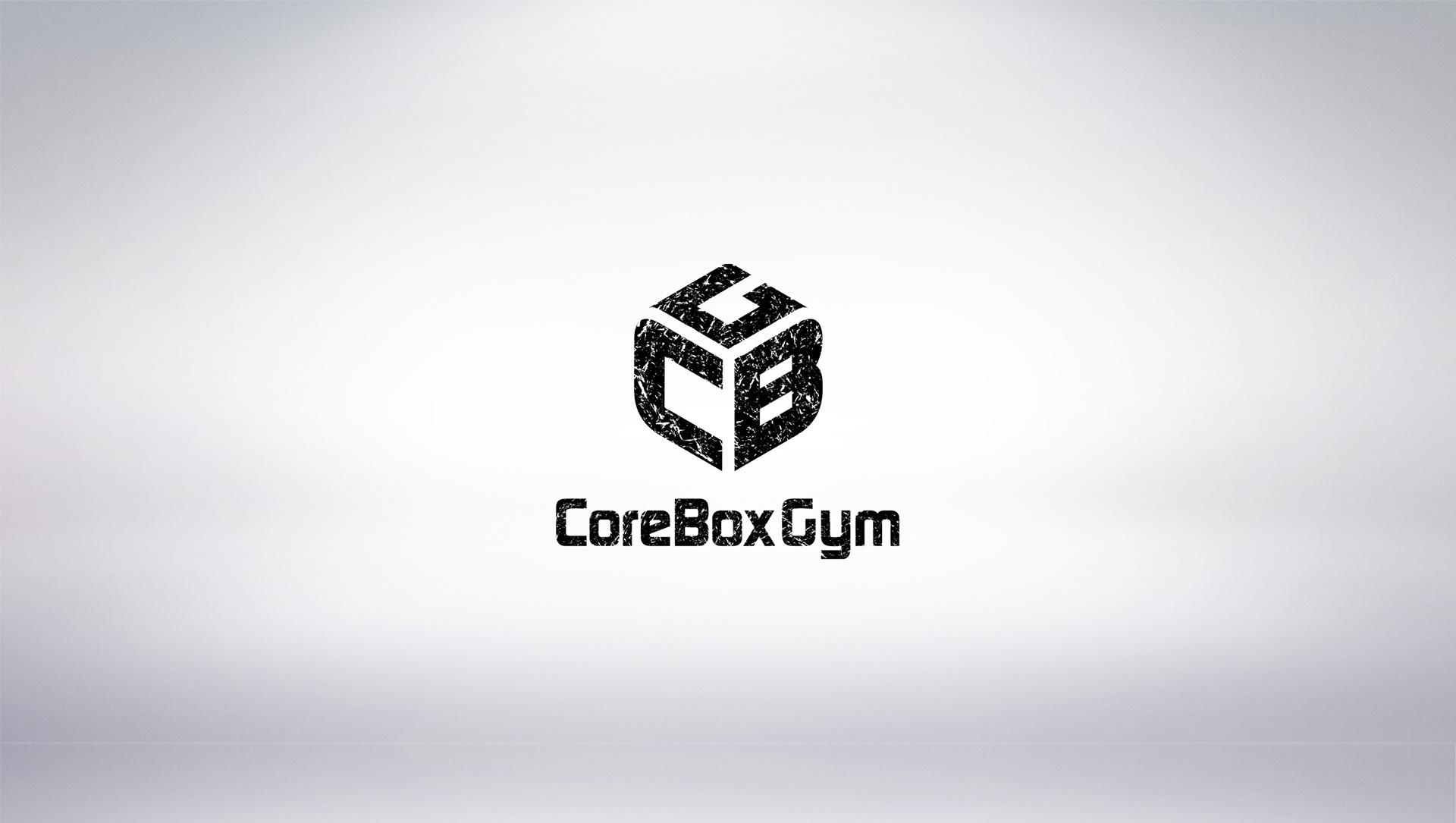
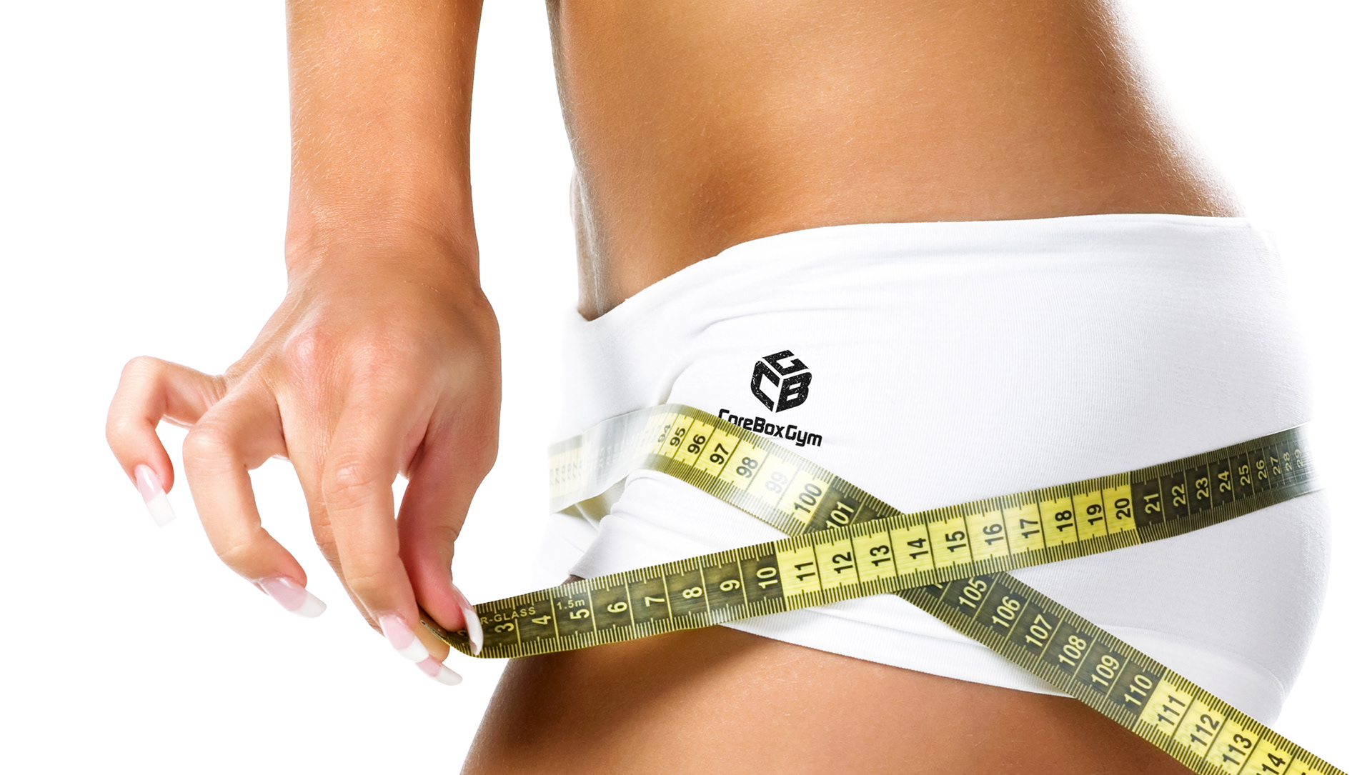
Created for an alternative, extreme gym with aspirations of becoming a national franchise. CBG forms a box, which is a piece of equipment athletes do vertical leaps onto. This logo just looks tough and gritty, which is exactly what the client wanted.
Created for a blog dedicated to providing guidance for living a gluten free lifestyle.
Created for a technology-services provider for charitable and humanitarian organizations. One goal was to symbolize "heart" because HRT's products will be at the core of streamlining their clients' processes. Another was to touch on HRT's global reach.
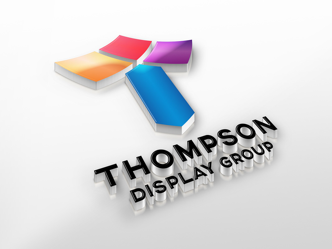
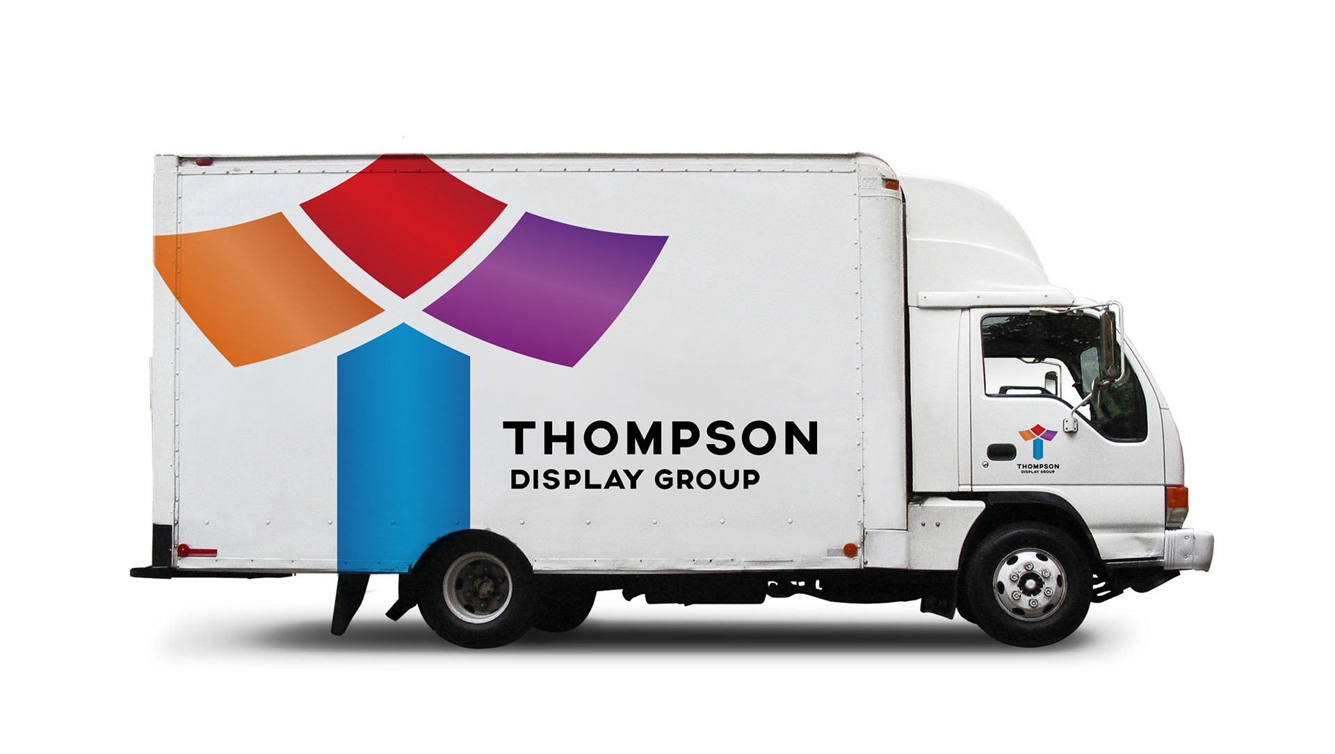
This logo was created for a company that distributes unique display frames, which allow for printed fabric panels to drape from ceilings, wrap around pillars, form cylinders, and just about any shape one can think of. A "T" is formed from draping panels (the top portion) and a pillar (the bottom portion).
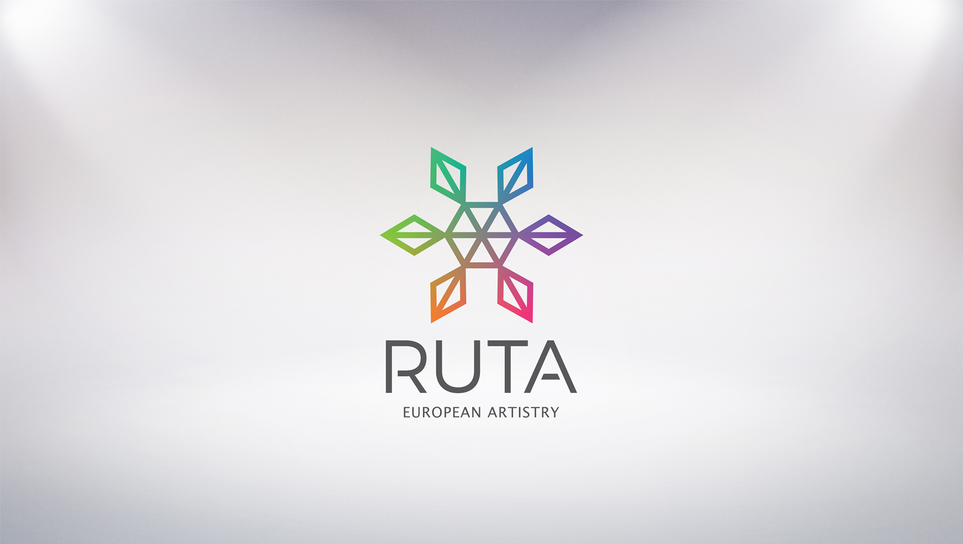
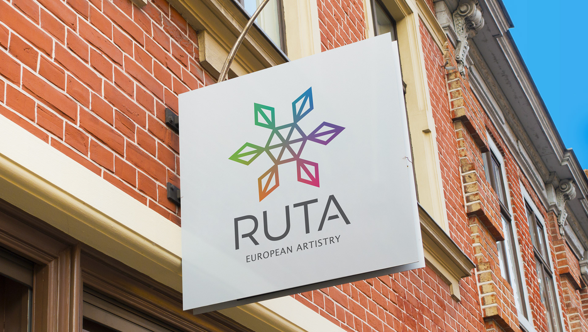
Created for a Bucks County retail store specializing in affordable, Lithuanian artwork, this logo resembles authentic Lithuanian, straw art and utilizes custom drawn letters.
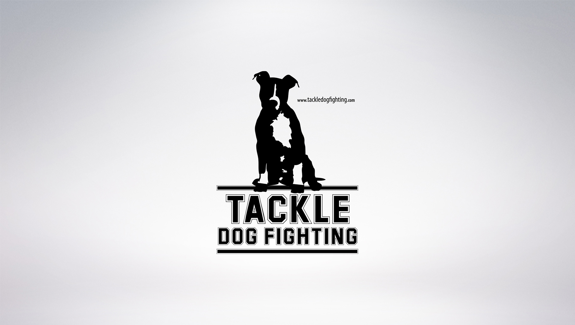
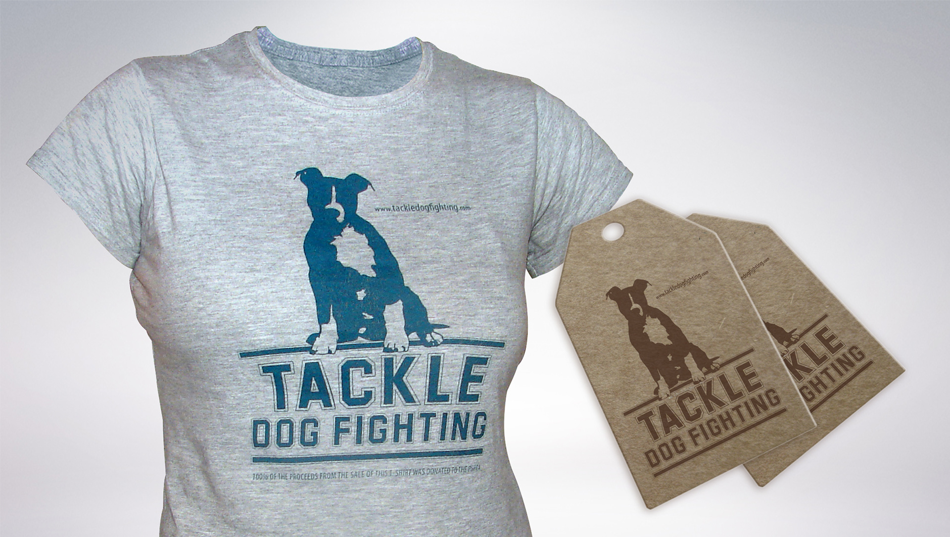
This logo was created for a dog fighting awareness campaign benefiting the PSPCA. The campaign was launched shortly after the highly controversial signing of Michael Vick to the NFL's Philadelphia Eagles. The logo was utilized on T-shirts, clothing tags and a website, all of which helped raise over $10,000!
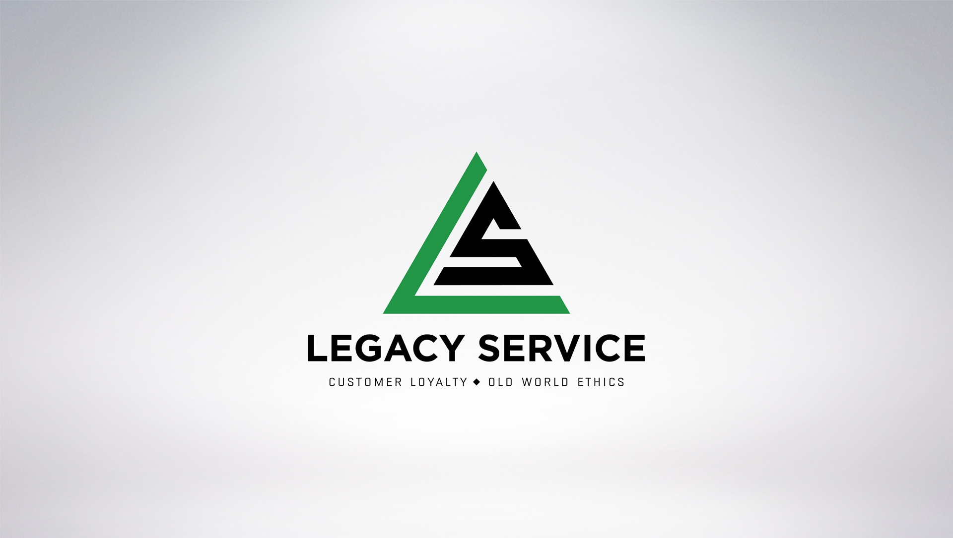
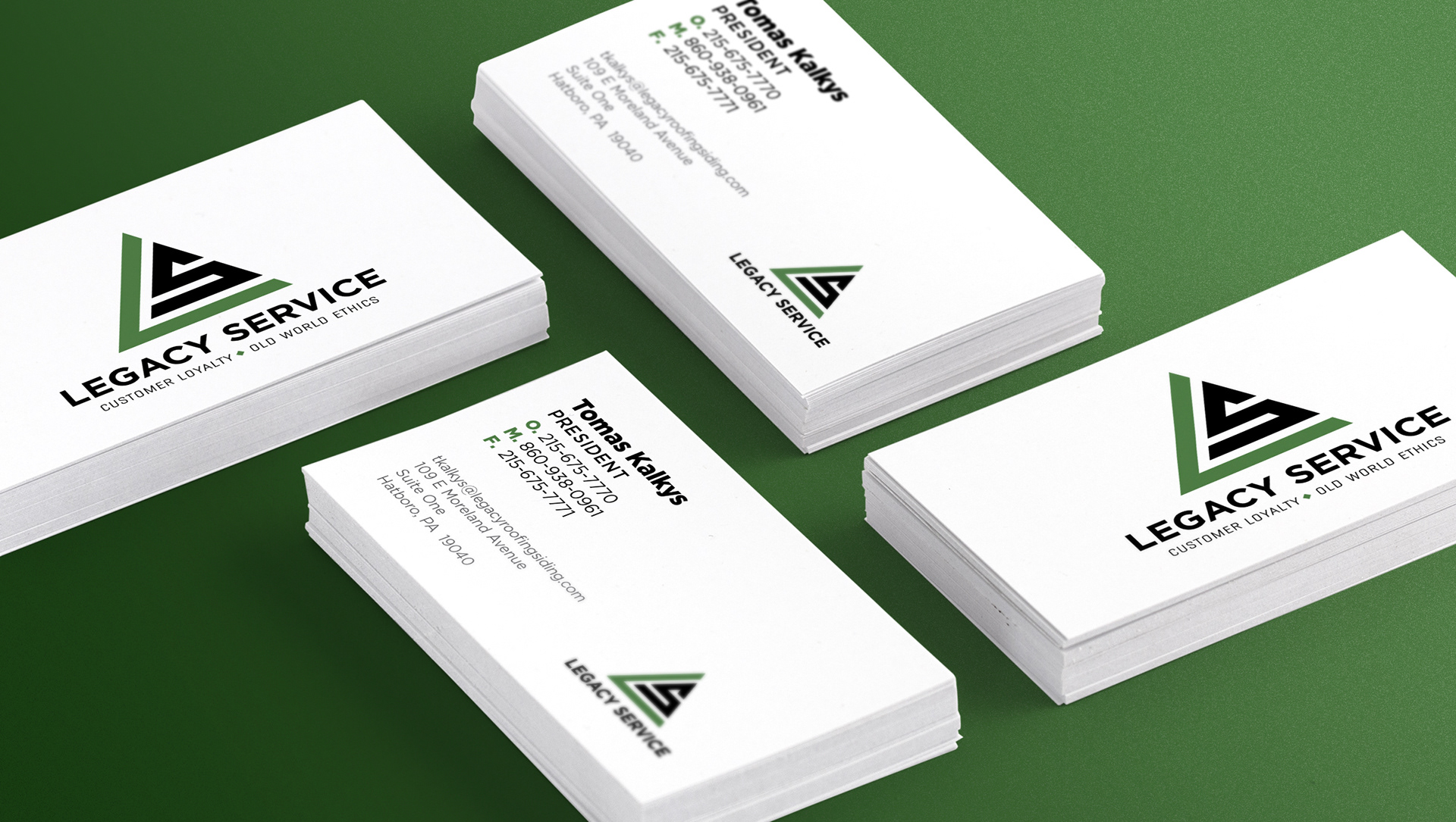
Created for a roofing company that manufactures and installs roofs for residential and commercial buildings. The owner desired the logo have a solid permanence, which was achieved through the use of a pyramid shape to form the company's initials.
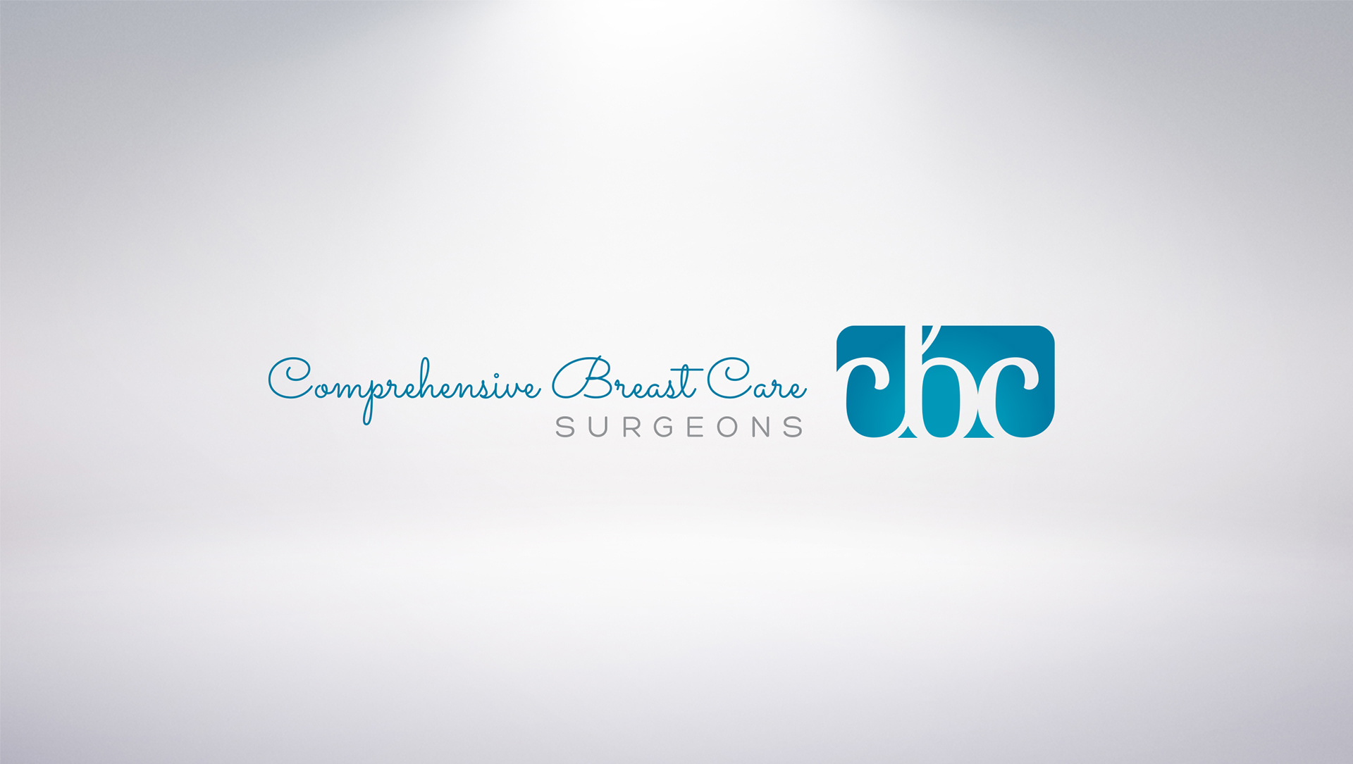
Requirements were to form a ligature from CBC, and stay away from pink. The client wanted to appeal to both sexes, as both are diagnosed with breast cancer. The blue colors appeal to males, and the curly font appeals to women. "SURGEONS" was deliberately set with wide kerning for emphasis, and the font screams precision.
Created for a startup company specializing in medical education apps for mobile devices.